Hans Rosling -The Joy of Stats

December 26, 2010

“I kid you not, statistics are now the sexiest subject on the planet.”

Hans Rosling

Hans Rosling is my idol, his online lectures are of this eye-opening, mind-expanding and funny kind. He is not only the developer of gapminder, a really cool information visualization software for animation of statistics but also an international known medical doctor, academic, statistician and public speaker.
In his videos ‘The Joy of Stats’ he shows exactly why some people (including me) have a passion for statistics, it is exciting and fun to find the story behind the data, tell it in a visual appealing way and make sense of the world.

You can find many more great lectures on TED or of The Joy of Stats series.

UPDATE: The Joy of Stats is now available in its entirety on Gapminder


Protovis – a graphical toolkit for visualization

May 23, 2010

Protovis is a visualization toolkit for JavaScript that takes a graphical approach to data visualization by allowing the user to specify how the data should be encoded in the marks representing it on the screen. Protovis uses SVG image for rendering, allowing visualizations to be seamlessly inserted into pages.

The developers describe the advantages as:

“It retains the conceptual simplicity and low-level control of graphical systems by dealing directly with graphical elements (shapes, lines,i.e., marks), but specifies marks declaratively as encodings of data. Additionally, we provide useful abstractions as optional tools to simplify visualization.”

Here are some examples:
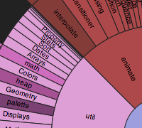
Sunburst

Oakland

Heatmap

Dot

Nightingale´s Rose